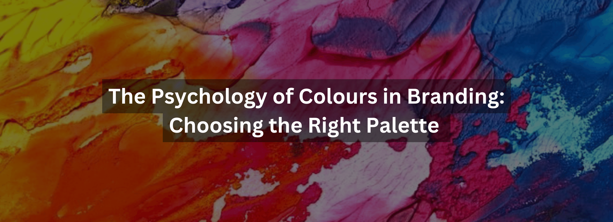
Monday Sep 26,2023
In the world of branding, every colour choice is more than just an aesthetic decision; it's a strategic move deeply rooted in the psychology of colour. The colours you choose for your brand have the power to evoke emotions, influence perceptions, and leave a lasting impression on your audience. In this blog, we'll dive into the fascinating realm of colour psychology in branding and guide you on how to select the perfect palette for your brand.
The Impact of colour on Emotions
colours have the remarkable ability to trigger specific emotions and associations in our minds.
Here's a closer look at some common colours and the emotions they tend to evoke:
Red
Red is bold, energetic, and attention-grabbing. It often represents passion, love, and
excitement. Brands like Coca-Cola and Netflix incorporate red to evoke feelings of intensity and
excitement.
Blue
Blue is calm, trustworthy, and dependable. It's commonly associated with professionalism,
reliability, and tranquility. Tech giants like IBM and social media giant Facebook use blue to
convey trustworthiness and competence.
Green
Green symbolizes growth, nature, and health. It's often associated with eco-friendly and
sustainable brands. Companies like Whole Foods and Starbucks incorporate green to convey a
commitment to environmental responsibility.
Yellow
Yellow radiates happiness, positivity, and optimism. It's an attention-grabbing colour that can
convey a sense of warmth and friendliness. Brands like McDonald's and IKEA use yellow to
create a welcoming atmosphere.
Purple
Purple is often linked to luxury, sophistication, and creativity. It can create a sense of exclusivity
and prestige. Brands like Cadbury and Hallmark use purple to evoke a sense of elegance and
quality.
Orange
Orange is energetic, playful, and enthusiastic. It's often used by brands to convey a sense of fun
and creativity. Companies like Fanta and Nickelodeon use orange to capture attention and
inspire enthusiasm.
Building Brand Identity with colour
Your brand's colour palette should align with its personality and values. Here's how to choose
the right colours for your brand identity:
1. Understand Your Target Audience
Consider the preferences and cultural associations of your target audience. Different colours
can have different meanings in various cultures, so it's essential to be mindful of your global
reach.
2. Define Your Brand Personality
Think about the personality traits you want your brand to convey. Is your brand sophisticated
and luxurious, or is it fun and playful? Your chosen colours should reflect these traits.
3. Competitive Analysis
Study the colours used by your competitors in the same industry. Your colours should help you
stand out while still fitting within the conventions of your niche.
4. Colour Harmony
Select a colour palette that provides harmony and balance. A well-designed palette should
include a primary colour that represents your brand's dominant traits and secondary colours
that complement and enhance its message.
Practical Application of colour
Once you've chosen your brand's colour palette, it's time to apply it consistently across all
brand assets and touchpoints:
1. Logo and Visual Identity
Your logo should prominently feature your primary brand colour, as it's the most memorable
element of your visual identity. Use secondary colours for accents and backgrounds as needed.
2. Website Design
Incorporate your brand colours into your website's design. Use them for buttons, headings, and
backgrounds to create a cohesive and visually appealing online presence.
3. Marketing Collateral
From brochures to social media graphics, ensure that your marketing materials consistently
reflect your brand's colour scheme. This fosters brand recognition and reinforces your
messaging.
4. Packaging
If you have physical products, your packaging design should reflect your brand colours. The
packaging itself becomes a powerful marketing tool, especially on store shelves.
5. Advertising
In your advertising campaigns, use colour strategically to elicit the desired emotional response
from your audience. Consider how colour choices affect the overall message of your ads.
Case Studies: Brands Nailing Colour Psychology
Let's take a look at a couple of brands that have masterfully applied colour psychology in their branding:
1. McDonald's
McDonald's iconic use of red and yellow is no accident. Red grabs attention and creates a
sense of urgency, while yellow radiates happiness and positivity. These colours combine to
create a fast-food experience that's both fun and quick.
2. Starbucks
Starbucks embraces a calming palette of green and earthy tones. This choice aligns with the
brand's commitment to sustainability, nature, and a relaxed coffeehouse atmosphere. It's no
wonder customers often view Starbucks as a refuge from the daily grind.
The Ever-Evolving Nature of Branding
It's essential to recognize that branding is not static; it evolves with your business and your
audience's changing preferences. As your brand grows and matures, you may need to revisit
your colour palette and make adjustments to stay relevant and effective.
Conclusion
In the world of branding, the psychology of colour plays a pivotal role in shaping how your
audience perceives and connects with your brand. By understanding the emotional impact of
different colours, defining your brand's personality, and applying your chosen palette
consistently, you can harness the power of colour psychology to create a memorable and
compelling brand identity. Remember that colour is not just about aesthetics; it's a powerful tool
that can help you tell your brand's story and forge a deep connection with your audience.
Choose your colours wisely, and watch as they become an integral part of your brand's success
story.